Case Study: Design Systems at Scale for
Rapid Project Delivery
Case Study: Design Systems at Scale for
Rapid Project Delivery
A representative project created to reflect my design process
A representative project created to reflect my design process
Project Overview
In a fast-paced, multi-client environment, internal teams were working with fragmented design systems that were either too rigid, or too costly to adapt. Clients lacked the time or budget to reinvent a system for each engagement, yet still expected speed, brand consistency, and polish.
To solve this, the creation of a flexible, themeable design system built for reuse across projects was created. Designed with token-based architecture and responsive components, the system empowered designers and developers to move faster—without sacrificing quality or cohesion. Clear documentation and governance enabled seamless dev implementation and consistent adoption across teams.
This case study serves as a proxy for several client engagements under NDA. It’s intended to demonstrate my process, design systems expertise, and impact.
Role:
Collaborative design team effort, later led system creation and structure
Scope:
Design System Creation, Component Library, Scalable Architecture
Timeline:
1 year
Tools:
Figma and AEM
Goals
To resolve these systemic challenges, the team and I focused on building a system that was:

Flexible
Components that could adapt to different brands and layouts

Tokenized
To support quick theming and accessibility compliance

Scalable
Built to grow with needs, not start from scratch each time

Governed
With clear documentation and contribution rules

Developer Friendly
Easily implemented, documented, and QA-ready

Rooted in Design Foundations
With a shared language for grids, spacing, interaction states, and elevation
Solution
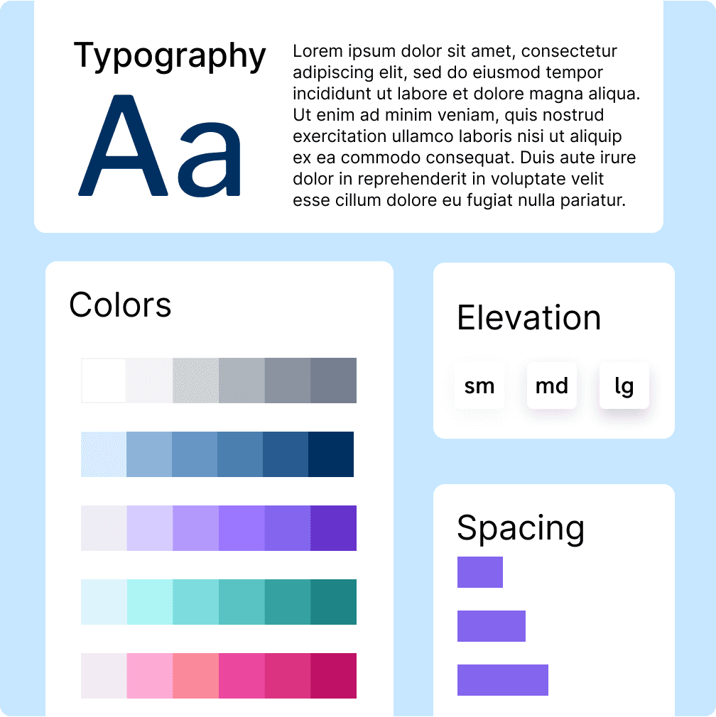
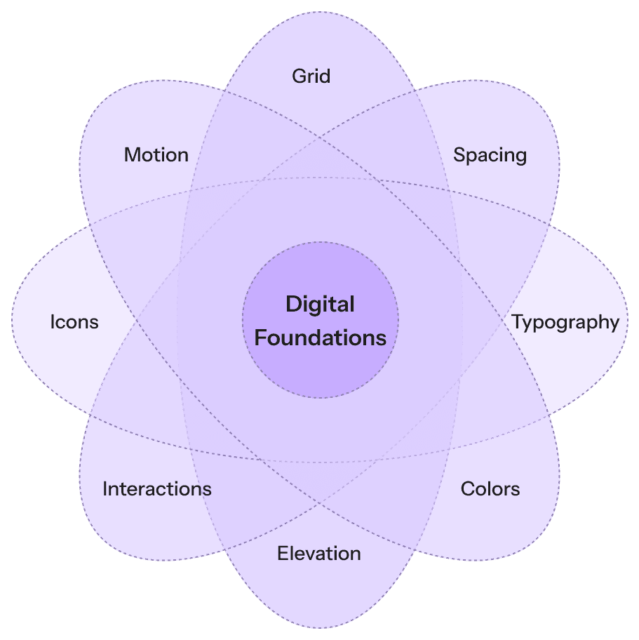
Design Foundations First
A system is only as strong as its foundations. Early work focused on defining:
A responsive grid system that scaled fluidly across breakpoints
A spatial scale and spacing token system to enforce hierarchy and clarity
Elevation levels for clarity in layering (modals, overlays, content blocks)
Standardized interaction states for all interactive components (hover, focus, disabled, etc.)
A type scale with semantic naming (e.g., heading-lg, body-sm)
These rules made the system feel purposeful and predictable across projects.
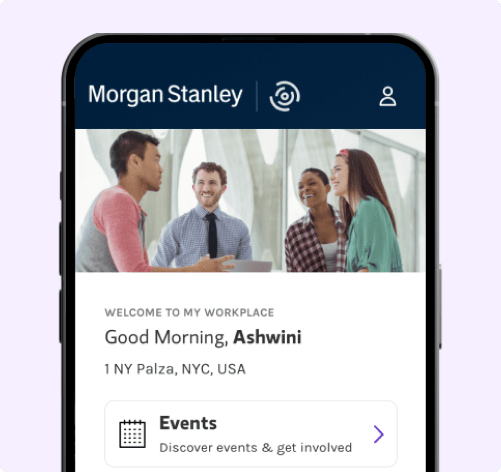
Worked hands-on with Modo’s platform to understand limitations in layout, interaction, and content hierarchy. Collaborated with platform developers and support to uncover hidden capabilities and workarounds.
Digital System Architecture
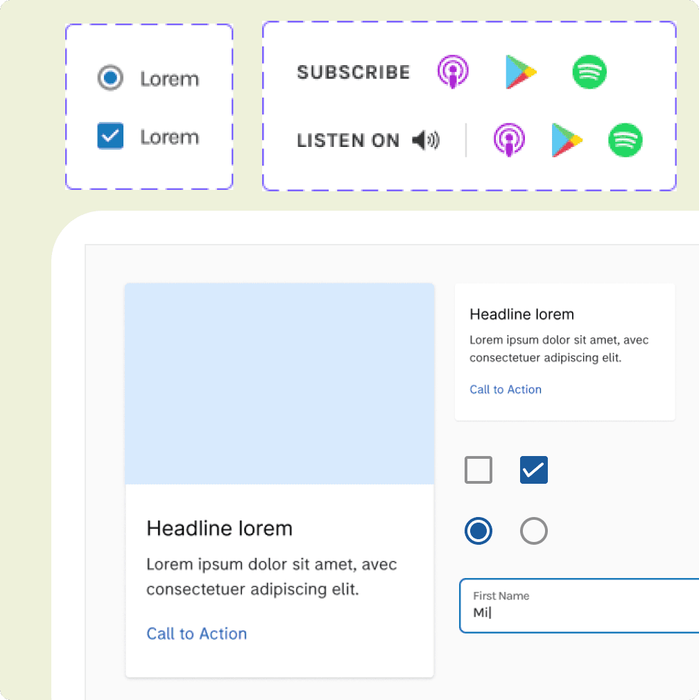
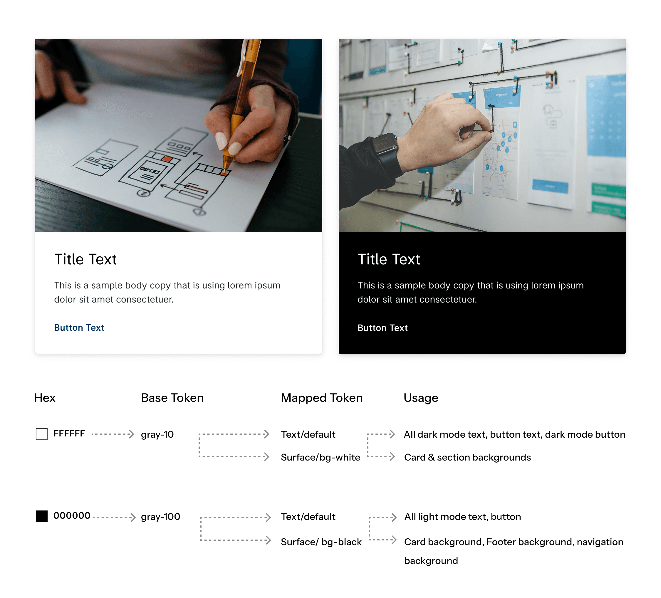
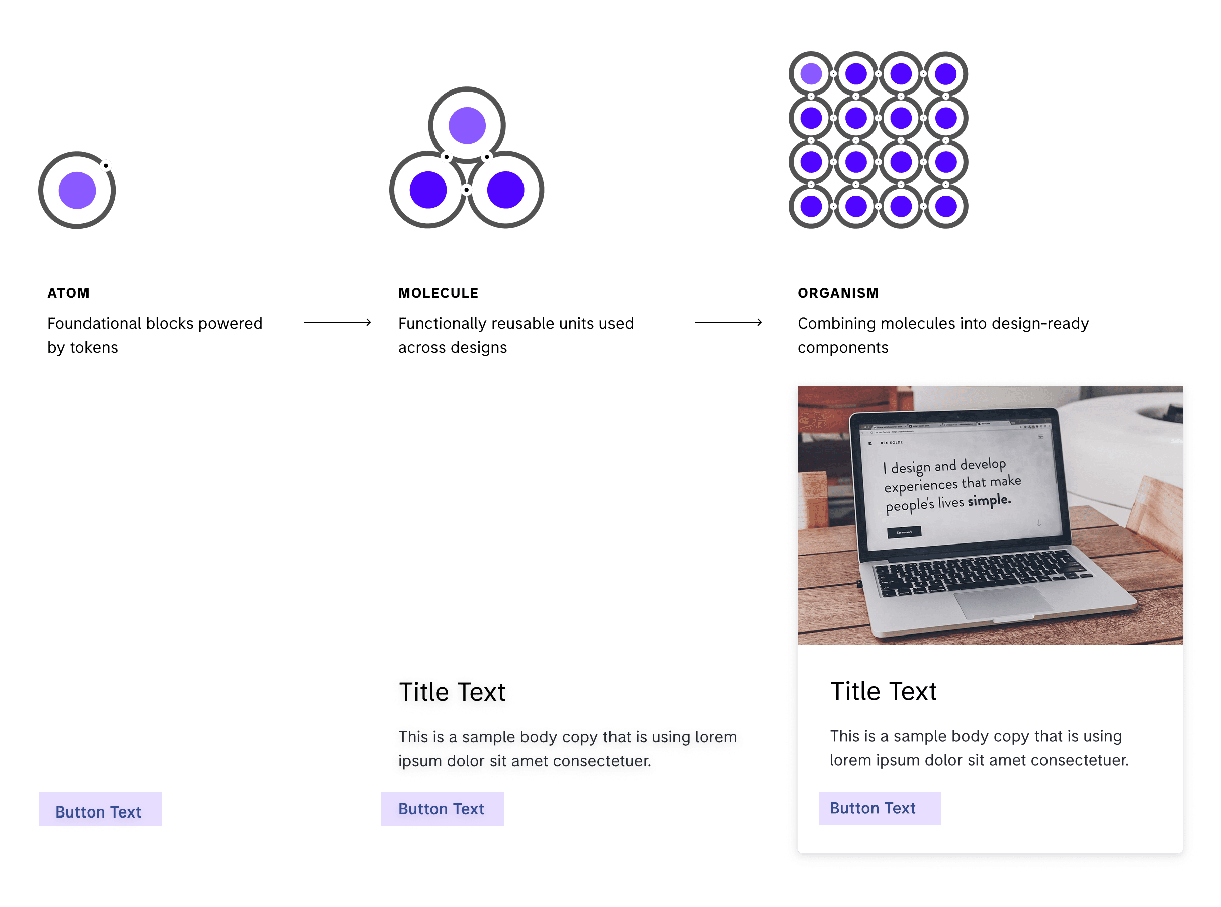
Built using atomic design principles, the system was structured as:
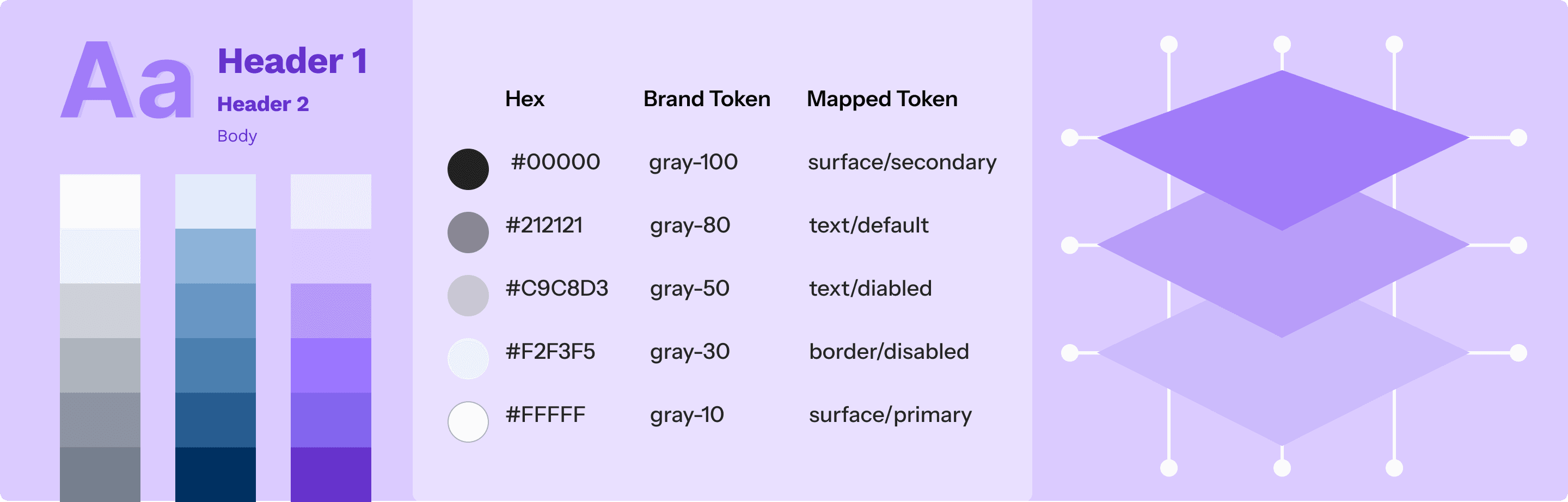
Tokens first: Color, typography, spacing, and border radius were defined semantically and theme-ready
Components second: Built from smallest atoms (e.g., buttons, inputs) to molecules (e.g., cards, modals)
Patterns last: Repeatable layouts and templates assembled from components
Libraries were centralized in Figma and mapped for dev handoff with a tokenized approach.
Worked hands-on with Modo’s platform to understand limitations in layout, interaction, and content hierarchy. Collaborated with platform developers and support to uncover hidden capabilities and workarounds.
Component Creation Process (End-to-End)
Each component followed a rigorous, collaborative process to ensure quality and reusability:
Product requirements gathering
UI audit of past solutions and pain points
Competitive and best-practice benchmarking
Accessibility built-in from day one (contrast, keyboard states, screen reader roles)
Interaction design: Multiple states and behaviors defined
Internal feedback loops with product, design, and dev
User testing in context where applicable
Detailed developer handoff, specs, and usage guidance
QA testing and implementation reviews post-dev handoff
This ensured consistency, clarity, and confidence—no surprises during implementation.
Worked hands-on with Modo’s platform to understand limitations in layout, interaction, and content hierarchy. Collaborated with platform developers and support to uncover hidden capabilities and workarounds.
Documentation and Governance
Every component and token was documented with:
Usage rules, dos and don’ts, and edge cases
Token Master for cross team collaboration
Figma how-to notes and dev-ready specs
Contribution guidelines for designers and devs
Versioning strategy to support ongoing evolution
This minimized onboarding time and ensured everyone—from juniors to engineers—could plug in and contribute effectively.
Worked hands-on with Modo’s platform to understand limitations in layout, interaction, and content hierarchy. Collaborated with platform developers and support to uncover hidden capabilities and workarounds.
Impact
To resolve these systemic challenges, the team and I focused on building a system that was:
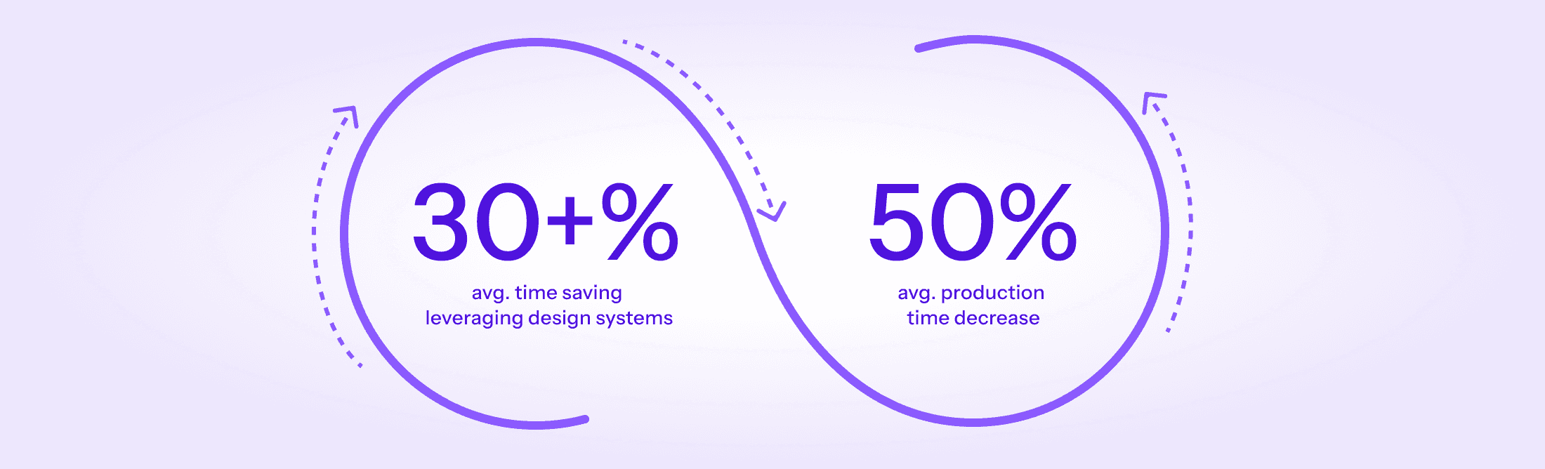
Faster Design Velocity
Cut down design timelines by 35% through ready-to-use, flexible components and strong foundations.
Cost Efficiency
Reduced overall project design and dev costs by up to 50%, thanks to reusability and reduced rework.
Modular and Scalable
Built with atomic design principles—components scale across brands, themes, and platforms effortlessly.
Design Thinking, Built In
Every component was informed by competitive audits, accessibility, and user testing, ensuring quality.
Developer Friendly
Detailed documentation and consistent patterns improved dev handoff and collaboration, reducing friction.
Easy Maintenance & Updates
Centralized libraries and token-based theming allowed for faster iterations and lower upkeep costs.
Reflection
This system project showed how strong design foundations + collaborative structure + practical governance can deliver results that scale. From creating consistent components to enabling faster delivery across client work, the payoff was both immediate and long-term.
Even in NDA-bound environments, the system served as a blueprint for resource-efficient, accessible, and developer-friendly design at scale.
More Projects You Might Like
Dive deeper into my portfolio to see how I tackle different challenges with consistent quality and vision.